— Brand & Graphic Designer
Experience with International Brands | Motion & Print
Crafting visual stories for brands and individuals. Specializing in print design, brand identity, web experiences, and motion graphics.


Brand Collaborations & Projects
Work across international brands and independent practice
ICICI Bank
Goal
Design sophisticated email creatives for ICICI Bank campaigns targeting both premium and mainstream banking audiences
Target Audience
High-net-worth individuals (HNI), premium banking clients, and retail customers exploring financial and home loan products
Visual Approach
Vertical-format email creatives with refined typography and a clean, premium aesthetic suitable for both wealth management and consumer banking communications
Email creatives for ICICI Bank campaigns needed to balance clarity, trust, and a sense of premium value across different audience segments. I designed a series of vertical-format emails promoting financial and property-related offers, focusing on clean layouts, refined typography, and clear messaging—ensuring each piece feels polished, accessible, and aligned with both wealth and retail banking communication styles.


L'Oréal
Goal
Translate marketing campaign concepts into visual design across multiple digital and print formats
Target Audience
Consumers of L'Oréal brands (including Garnier and Fructis) as well as internal marketing and sales teams
Visual Approach
Developed banner campaigns, microsite visuals, and printed materials with strong product focus, clear hierarchy, and brand-consistent typography, working closely with the L'Oréal marketing team to visualize campaign ideas and propose creative directions
Marketing & Sales Manual
Internal marketing and sales manual for L'Oréal teams
This project started with that exact challenge: create a marketing and sales manual that could be used daily by different teams, without losing clarity or brand integrity. While working with L'Oréal India, I designed a manual that acts less like a rulebook and more like a working tool. The goal was to make complex guidelines feel structured, intuitive, and actually usable in real scenarios — whether in the office or in the field.


Micro-sites
Product-focused microsites supporting L'Oréal digital campaigns
Each microsite was built around a specific L'Oréal campaign or event, where the challenge was to capture attention quickly while clearly communicating the product story. The focus was on guiding users through campaign narratives in a way that feels dynamic, clear, and easy to follow — supporting both exploration and conversion.


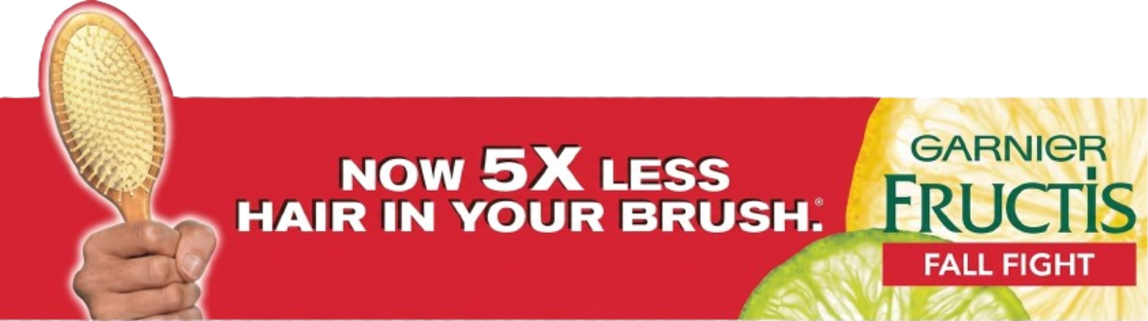
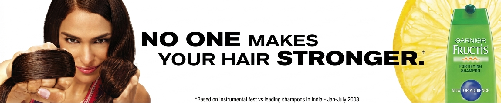
Banners
Fructis & Garnier Campaign Banners
Campaign banners for Fructis and Garnier were designed to stand out instantly within limited space. I focused on bold typography and strong product presence, using horizontal layouts to deliver clear, high-impact messages at a glance.
Softsheen Carson
Goal
Adapt and elevate an existing template into a cohesive, visually engaging page that aligns with brand standards while effectively presenting product messaging
Target Audience
Beauty consumers, with a focus on audiences engaging with textured hair care and styling products
Visual Approach
Structured, template-based layout refined through careful typography, spacing, and visual balance, with emphasis on product storytelling and brand consistency
Working within an existing global template often leaves little room for structural changes, so the focus shifts to precision and refinement. For Softsheen Carson, I designed a single-page experience that stays fully aligned with HQ guidelines while improving clarity and visual flow. The challenge was to make the page feel intentional and engaging within fixed constraints — using typography, spacing, and composition to bring forward the product story without overcomplicating the layout.

Freelance Projects
Indian Paintings: Art Book Design & Print

The challenge for this project was to translate the vibrant, textured world of a French artist's "Indian Paintings" into a high-end, dual-language art book for the Kala Ghoda Library. The client, Didier Villanueva, wanted to move away from the typical glossy finish of digital art books, seeking a tactile experience that mirrored the original canvas.
To achieve this, I focused on material storytelling. I selected Fedrigoni Stucco Tintoretto Gesso paper to provide a rich, canvas-like texture and opted for a 5-color print process to ensure the depth and vibrance of the digital fractals and paintings were preserved. By balancing structural precision with premium material choices, I delivered a custom print solution that feels as much like an artifact as a book.
“To Neil Dasgupta, a great thanks for your dedication - and patience - thanks to which this project has become a reality.”— Didier Villanueva, artist


Material choices
Paper
Fedrigoni Stucco Tintoretto Gesso — canvas-like texture that mirrors the tactility of the original works
Print process
5-color offset printing to preserve the full depth and vibrance of digital fractals and paintings
Format
Dual-language (English / French) — crafted to reach both local and international audiences
Digital Covers
Cover designs for digital publications
Ebook Cover: "Confessions of a Married Indie Woman"

For Nisha's debut book, the challenge was to craft a visual identity that felt as bold and unfiltered as her writing. To meet the client's vision of a story caught between two worlds, I bridged the gap between traditional Indian heritage and the modern NRI experience.
I implemented an "East-meets-West" aesthetic, pairing vibrant sugar-sculpted figurines with a classic tiered wedding cake. By framing the title in a garland-inspired typeface and surrounding the couple with "whispered" confessions, I created a cover that feels both culturally rooted and provocatively modern. The result is a high-impact design that captures the attention of a global audience while staying true to the heart of the author's heritage.
- Author
- Nisha Oza
- Category
- NRI Fiction / Cultural Memoir
- Deliverable
- Ebook Cover Art & Typography
- Key Concept
- East-meets-West / Modern Heritage
- Design Style
- Vibrant Narrative Fusion
Editorial Design: CRISIL Insights Report

In 2010, as CRISIL expanded its digital reach for the B2B sector, I was entrusted with designing a high-impact cover for their CRISIL Insights report. The client wanted a visual that felt like a "spectacle" — a marvel that conveyed global influence and momentum.
To capture this "universe powerplay," I implemented a cinematic, minimalist theme centered on a glowing planetary arc. By placing a brilliant light source at the horizon of the earth, I created a metaphorical "sunrise" to mirror the report's headline, The Shine is Back. This high-contrast approach allowed the financial data within to be framed by a sense of scale and optimism, turning a technical report into a compelling visual experience for a global business audience.
- Client
- CRISIL Limited (An S&P Global Company)
- Sector
- Financial Services / B2B Research
- Deliverable
- Digital Editorial Cover & Layout Direction
- Key Concept
- Global Scale & Market Optimism
- Design Style
- Cinematic Minimalism
Logo Designs
Brand identity marks that embed meaning into form
Brand Identity: Honey Badger Sales Team

In the midst of the 2020 lockdowns, a group of executives saw an opportunity to pivot toward the future of remote-ready, outdoor-capable manpower. They needed a brand identity that spoke to resilience and an uncompromising work ethic.
To bring this vision to life, I focused on the Honey Badger — an animal synonymous with tenacity and grit. My approach was to fuse the initial "H" with the mascot so they become one inseparable unit. By "carving" the badger's silhouette into the structure of the letter, I created a visual metaphor for the team's core values: strength built directly into the foundation. The result is a bold, modern mark that signals to clients that this sales team is as hardworking and relentless as their namesake.
Brand Identity: Atharva Charging

The challenge was to provide a technologically advanced yet deeply accessible identity for a growing city's first dedicated E-charging station, bridging the gap between modern sustainability and community ease.
I implemented a high-contrast, minimalist approach to ensure the station would be instantly recognizable from a distance. By pairing a bold, structural wordmark with a friendly, rounded EV icon, I created a sense of reliability and ease. The result is a professional identity that positions "Atharva Charging" as a bright, forward-thinking landmark in the city's evolving urban landscape.
Personal Drawings & Experiments
Drawings
Hand-Drawn & Digital Sketches


Motion & Interactions
Micro-interactions and motion design experiments
ROPE: Cognitive UX Experiment
A minimalist AI experiment designed to identify and dismantle learned internal boundaries through conversational reflection.
NB:Living prototype — focus is Cognitive UX and prompt-engineering logic, not production stability.

Synthesizing cultural folklore into visual metaphors using generative AI. The project began with this image: a giant elephant held captive not by the chain, but by the memory of one.
The UX Brief
Inspired by the Indian legend of the baby elephant held by a thin string, this project was a 48-hour vibecoding challenge. I moved from an AI-generated conceptual image of the legend to a functional application. The goal wasn't a polished consumer product, but a Cognitive UX proof-of-concept: using LLMs to guide users through a structured 7-day psychological audit.
Target
High-performing professionals and individuals navigating career or personal plateaus.
Visual Approach
Clean, minimalist light UI with a focus on high-readability typography and low cognitive friction. The interface prioritizes clarity and a calm, reflective space, moving away from high-contrast dark modes to foster transparency in the 7-day audit.
Challenge
From concept image to live URL in 48 hours.
Method
Natural-language coding
Status
Living prototype — focus is Cognitive UX and prompt-engineering logic, not production stability.
A Global Perspective on Design
I am a multi-disciplinary designer with a career shaped by movement and adaptation. Over the last decade, my work has spanned three distinct regions—from the corporate rigor of Mumbai to the creative landscapes of Ukraine and my current base in Bucharest, Romania. This international journey has taught me that while design trends change, the need for clear, logical communication is universal.
Having managed digital ecosystems for global giants like L'Oréal and ICICI across different borders, I've developed a unique ability to bridge cultural gaps through visual storytelling. Whether I'm designing for a high-stakes financial sector or experimenting with the latest in generative AI and Rive, I bring a "Swiss Army Knife" mindset to every challenge: versatile, precise, and prepared for any environment.
My approach is rooted in the belief that design is logic made visible. I don't just create visuals; I architect systems that work — built on a foundation of deep research and a decade of navigating the complexities of international brand standards.
Currently based in Bucharest and open to global collaborations, I help brands and creators find their voice in an increasingly interconnected world.
My Process
Immersion
I start by living in your brand's world. This means understanding your constraints, your audience, and the 'soul' of the message before a single pixel is moved.
Strategic Blueprint
Great design is logic made visible. I translate research into a clear visual direction, ensuring the creative path is both exciting and technically sound.
Craft & System
This is where art meets engineering. Whether it's a 5-color art book or a Rive state machine, I build cohesive systems that work across every touchpoint.
Refinement & Handover
A project isn't finished until it’s functional. I provide high-precision assets and the guidance needed to ensure the design thrives in the real world.
Solutions
Orchestrating Brand, Print, and Product
Brand Architecture & Identity Systems
I orchestrate scalable visual foundations that preserve a brand’s soul across every touchpoint. From high-stakes financial creatives to global brand manuals, I ensure visual integrity is never lost in translation.
The Art of Material Storytelling
Specializing in the physical dimension of design. I manage high-end print experiences where paper choice, ink precision, and tactile texture become the primary medium for the message.
Digital Ecosystems & Interactive Journeys
I build immersive digital environments that prioritize clarity and flow. By bridging the gap between static vision and functional code, I create campaign sites and interfaces that truly engage and perform.
Product Incubation & Human-Centric Design
I create digital tools and applications rooted in a deep understanding of people. By moving rapidly from a human insight to a functional prototype, I build products that feel intuitive, purposeful, and technologically sound.
Let's Build the
Next Solution
I'm always interested in hearing about new projects and opportunities. Whether you have a specific project in mind or just want to chat, feel free to reach out.
© 2026 Neil — Brand Architect & Product Creator. All rights reserved.